Actions
New feature / Change #4115
closedCreate preview component
Start date:
03/02/2022
Due date:
% Done:
0%
Estimated time:
6:00 h
Description
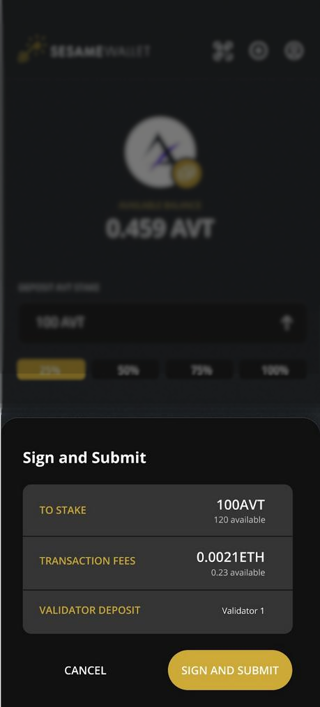
This modal will be used in various location in the app. It will used for the following purpose.
- Previous and signing API call request.
- Display transactions fees.
- Display additional information about what user is currently doing (not shown on mokup)
The background for previous page must be blur and darker.

Files
 Updated by Olivier Bitsch about 4 years ago
- Estimated time changed from 4:00 h to 6:00 h
 Updated by Olivier Bitsch about 4 years ago
- Subject changed from Create modal component to Create preview modal component
 Updated by Olivier Bitsch about 4 years ago
- Subject changed from Create preview modal component to Create preview component
 Updated by Olivier Bitsch about 4 years ago
- Assignee changed from Yaroslav Wen to Gilles Hemmerlé
 Updated by Gilles Hemmerlé about 4 years ago
- Status changed from In Study to Done
This component now exists and its name is Drawer. You can use as per the following :
<Drawer
  title="Choose something"
  actions={[
    <Button
      onPress={() => {}}
    >
      Button 1
    </Button>,
    <Button
      onPress={() => {}}
    >
      Button 2
    </Button>,
  ]}
>
  <Text>A content to be displayed</Text>
</Drawer>
Just pass the content and the buttons
Actions